
The Vinny team arrived at our studio with an idea to launch a vegan vending machine concept, but they had no name, identity, or online presence. We christened the brand, designed its unique look and feel, and created a tone of voice strategy which would set it apart from the competition. Our ongoing relationship means we’re helping Vinny grow by developing an eCommerce side of the business.
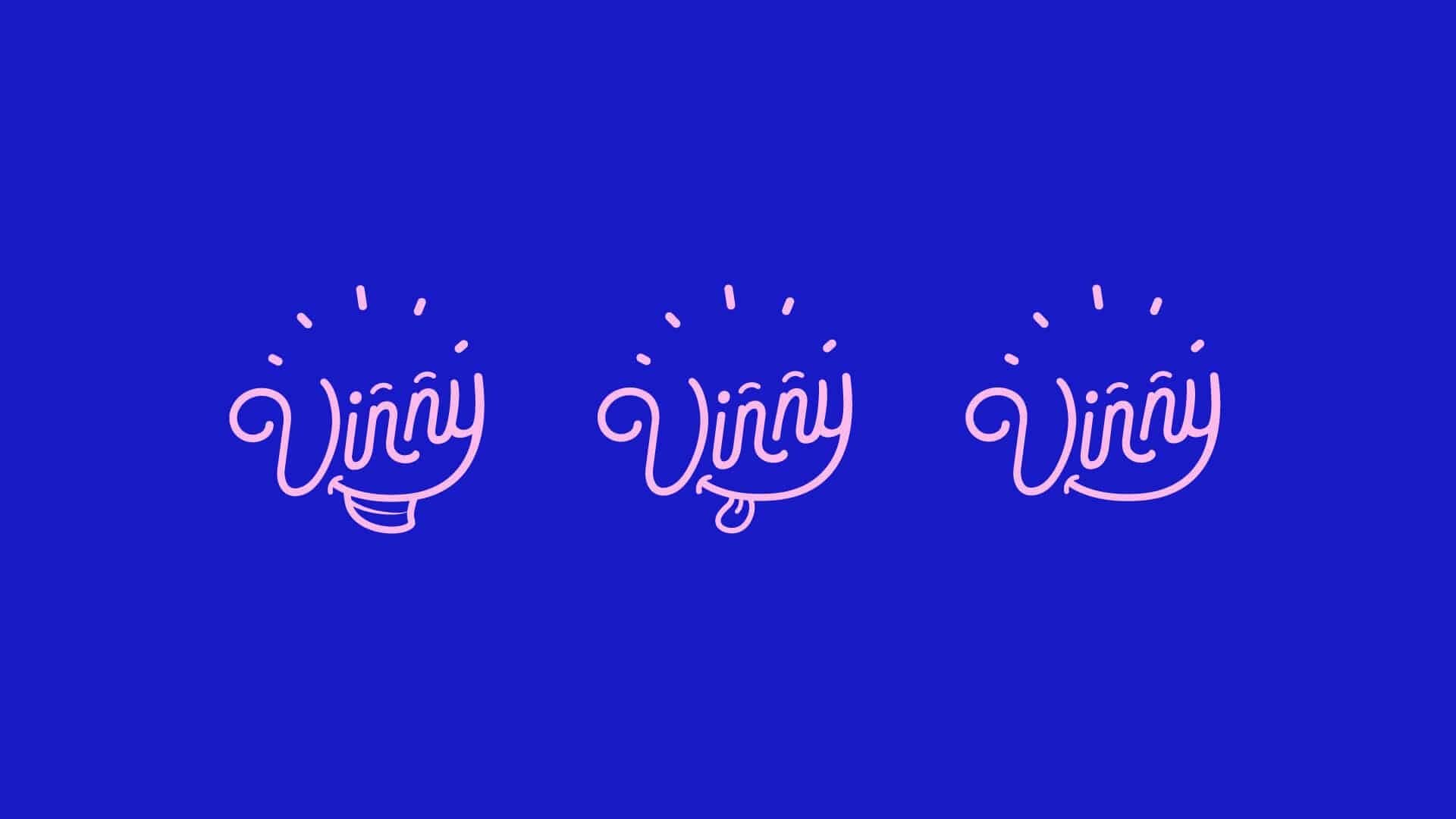
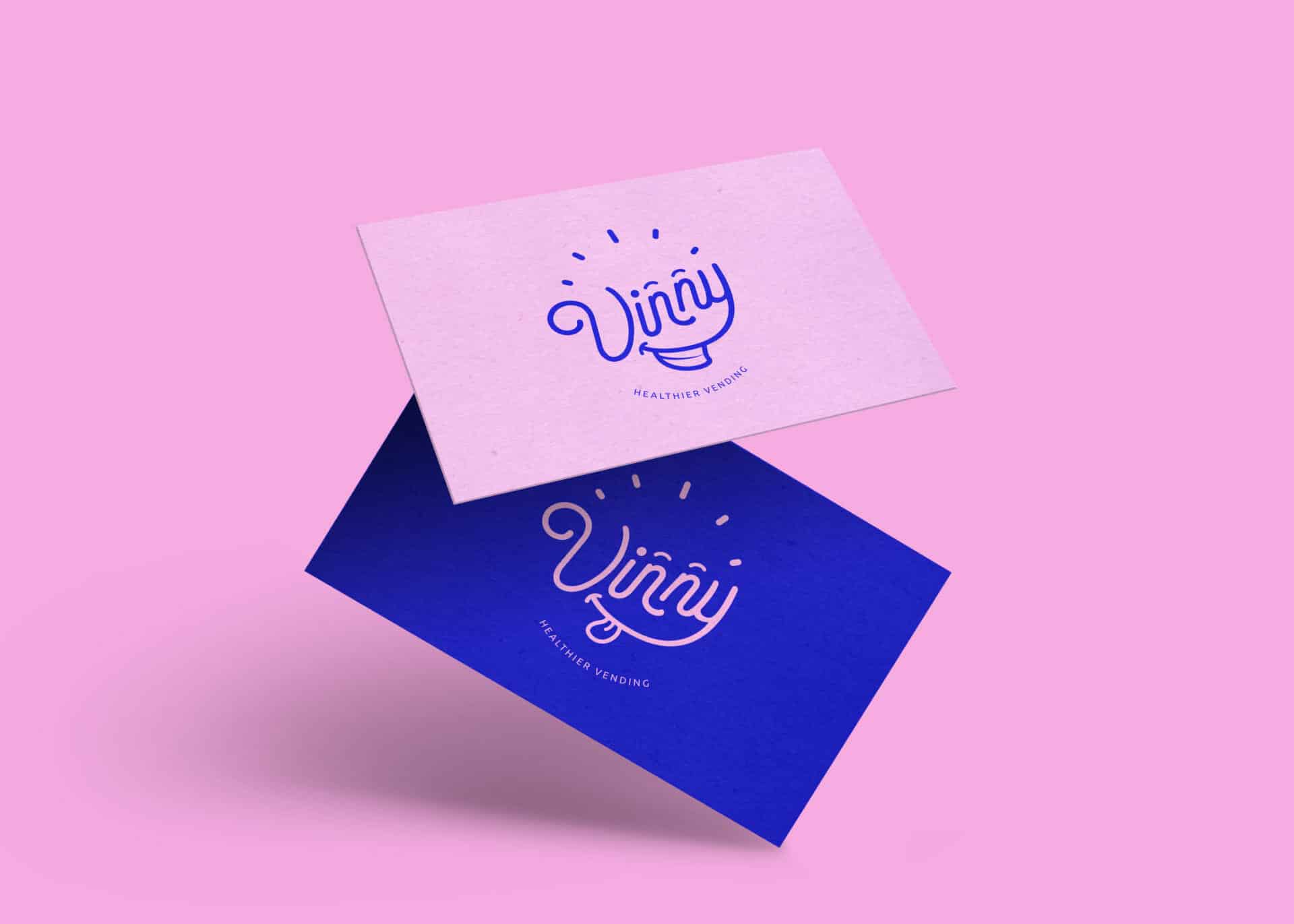
We chose to name the brand ‘Vinny’ because it is short, easy to remember and it humanises the vending machine. The initial V also relates to Vinny’s core value – veganism. A trademark and domain check showed us that there was no competition online – we were onto a winner!
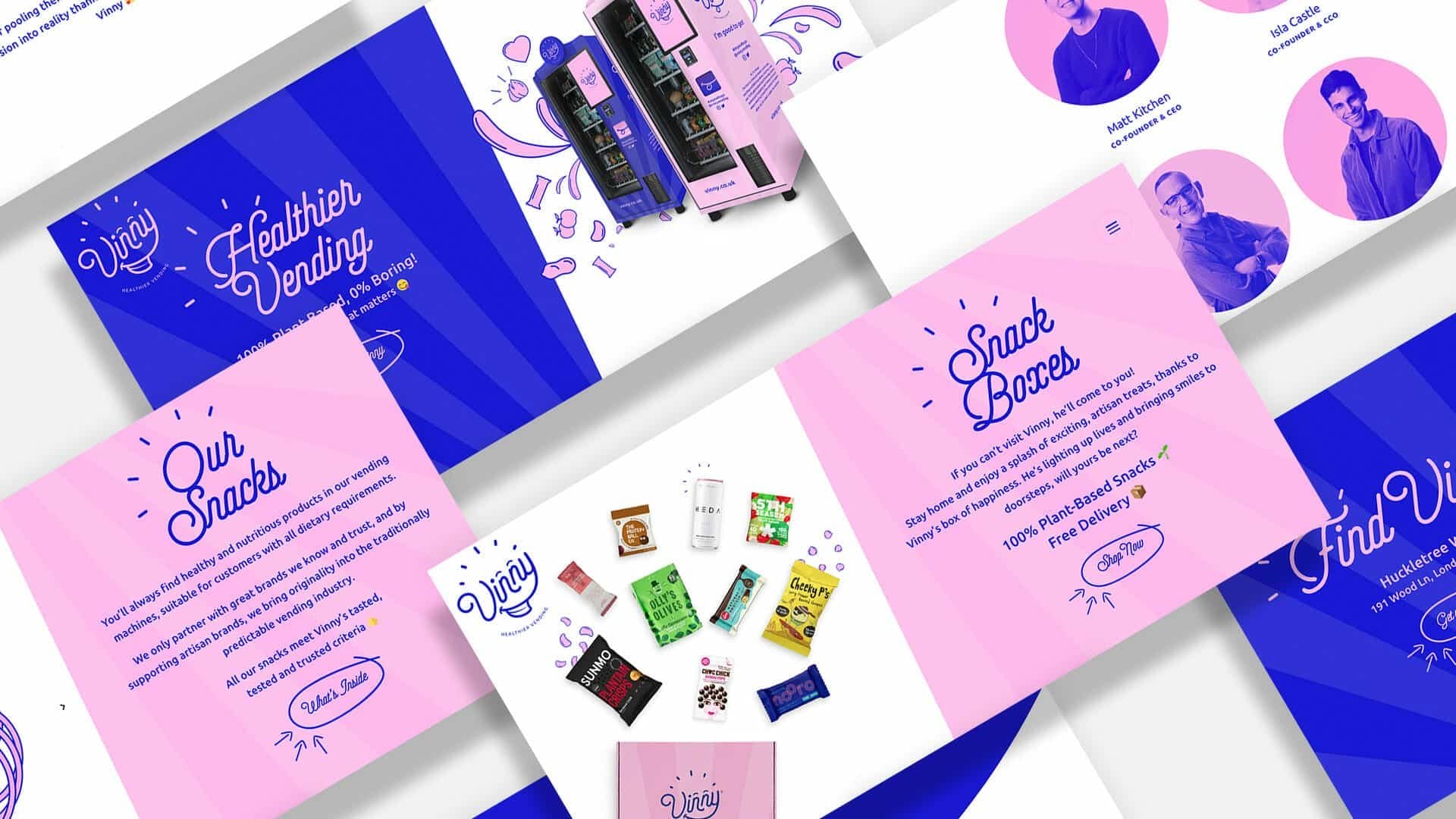
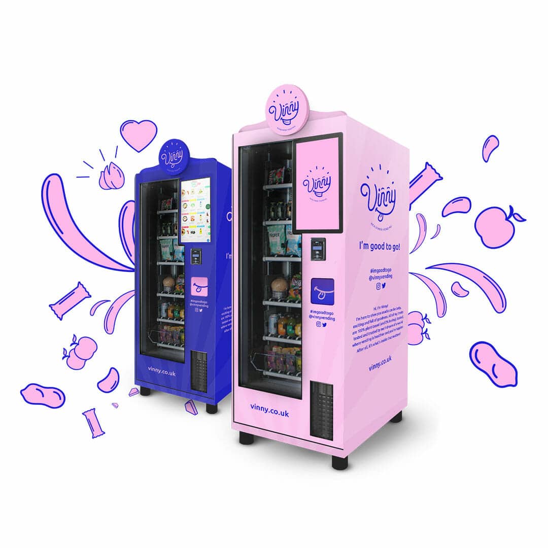
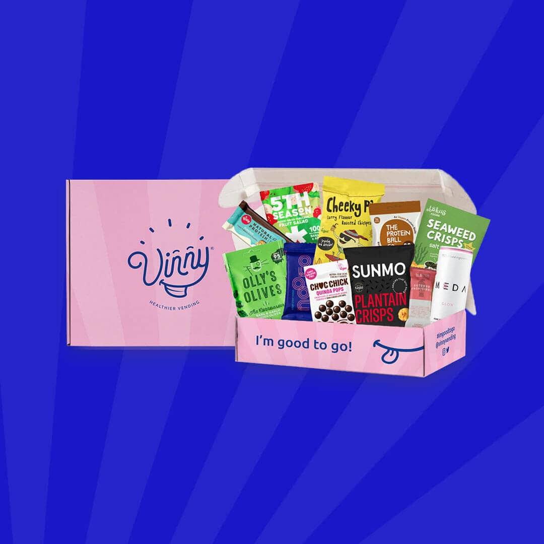
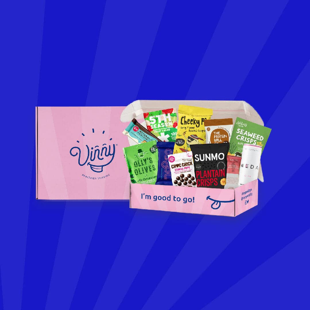
We balanced the masculinity of Vinny’s name with a bright pink colour scheme. Not only did this make the vending machine feel friendly, approachable and fun, it’s so distinct from other vending machines which are dull and lifeless. Vinny’s identity as a colourful, playful character helps him attract customers and disrupt the snacking industry.
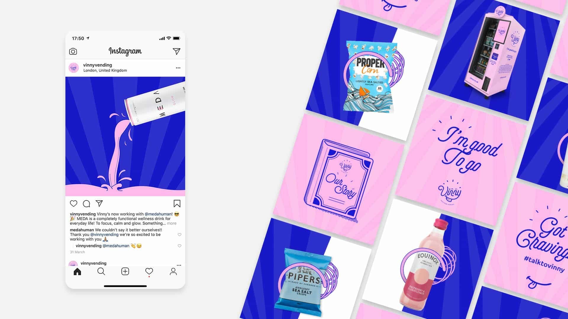
We created punchy, meaningful catchphrases like ‘Good to go’, ‘100% plant-based and 0% boring’ and ‘It’s what’s inside that matters’ to quickly and cleverly portray the brand’s values. We devised a tone of voice strategy which meant Vinny would always come across as casual, cheerful, playful and occasionally cheeky. We insisted that emojis were an important part of Vinny’s communications.
Vinny’s online presence matches his identity – it’s colourful, playful and engaging. We created short, simple but strong messaging, flowing from section to section (which alternate between his bright pink and blue), taking the user on a journey. We also designed an animation which brings Vinny’s icon to life and greets users as they enter the website.
Due to the Coronavirus pandemic, the vending machine business was put on hold. Instead of resting on our laurels, we saw an opportunity to create a snack box which could be delivered around the country. We built an eCommerce platform into the website, created new assets for social media, designed the boxes, and worked closely with the operations team for a successful launch.
| Cookie | Duration | Description |
|---|---|---|
| cookielawinfo-checkbox-analytics | 11 months | This cookie is set by GDPR Cookie Consent plugin. The cookie is used to store the user consent for the cookies in the category "Analytics". |
| cookielawinfo-checkbox-functional | 11 months | The cookie is set by GDPR cookie consent to record the user consent for the cookies in the category "Functional". |
| cookielawinfo-checkbox-necessary | 11 months | This cookie is set by GDPR Cookie Consent plugin. The cookies is used to store the user consent for the cookies in the category "Necessary". |
| cookielawinfo-checkbox-others | 11 months | This cookie is set by GDPR Cookie Consent plugin. The cookie is used to store the user consent for the cookies in the category "Other. |
| cookielawinfo-checkbox-performance | 11 months | This cookie is set by GDPR Cookie Consent plugin. The cookie is used to store the user consent for the cookies in the category "Performance". |
| viewed_cookie_policy | 11 months | The cookie is set by the GDPR Cookie Consent plugin and is used to store whether or not user has consented to the use of cookies. It does not store any personal data. |
Ready to discuss your project? Let’s talk.
London: Soho Works, London, E1 6JJ
Dubai: One JLT, Dubai, UAE
Email: [email protected]
